Get the latest direct to your inbox twice a week. Sign up today. 
Big Communications on the careful task of revamping Barfoot & Thompson’s 40-year-old look

Creating a campaign for a legacy brand can be difficult enough, owners can get stuck in the mentality of ‘that’s how it’s always been done’. However, rebranding a brand with a strong heritage and creating a campaign surrounding the work is a whole other ballpark of challenges. Here, Big Communications managing director Ant Salmon talks us through its work on the Barfoot & Thompson rebrand.
Back in October, Barfoot & Thompson had a complete overhaul of its identity which had been going for 40 years, however, the business itself was founded in 1923.
After decades in the public’s eye, its identity was feeling tired and Big Communications was enlisted to remedy it.
The task was no easy feat. The brand, although tired, was well known in New Zealand, and with 78 branches in Auckland alone, a large vehicle fleet, hundreds of different signs and piece of collateral.
For Ant Salmon, managing director of Big Communications, it was important to start the task with respect for the heritage.
“It is such a well-known New Zealand brand, with so many locations around and a huge focus on their staff and customers. We had to approach this rebranding with their values in mind, making sure that the new look and the campaign communicated their ethos.”
Out with the old
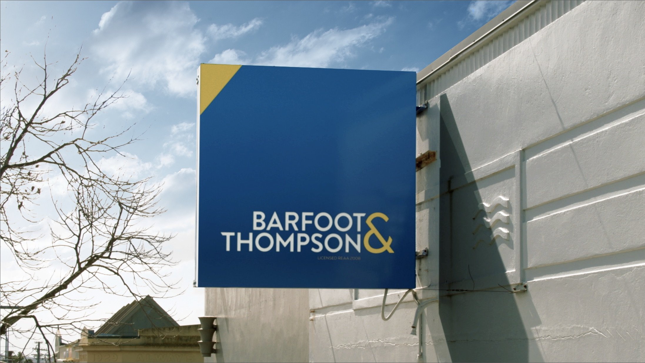
The new-look is no doubt a lot more modern than previous. Salmon says the new design was one of a few pitched, yet having the family members of the Barfoot & Thompson team present, including managing director Peter Thompson, helped the agency finalise the end result painlessly.
“It’s amazing when you’re working with such a close team, as they have obviously been a family together for many generations. Once everyone was in a room it was easy to decide on what they wanted. There was no waiting on international clients or long discussions, they were confident in what they wanted and gave us the chance to make it something great.”
Joe Holden, Big’s creative director, says that the nature of the project was clear from the outset. The final result had to be recognisably Barfoot & Thompson, but slick and modern to reflect the company it’s become.
“For the logo, a contemporary geometric font – all in uppercase for a cleaner look – was customised with unique touches. The new ampersand’s distinctive angular form makes a striking design statement. The blue was updated to navy, the logo colours reduced to two and the blue box has been retired to increase the logotype size on smaller formats like mobiles. Also, the ampersand’s angle is a recurring device across a wide range of branded assets.”
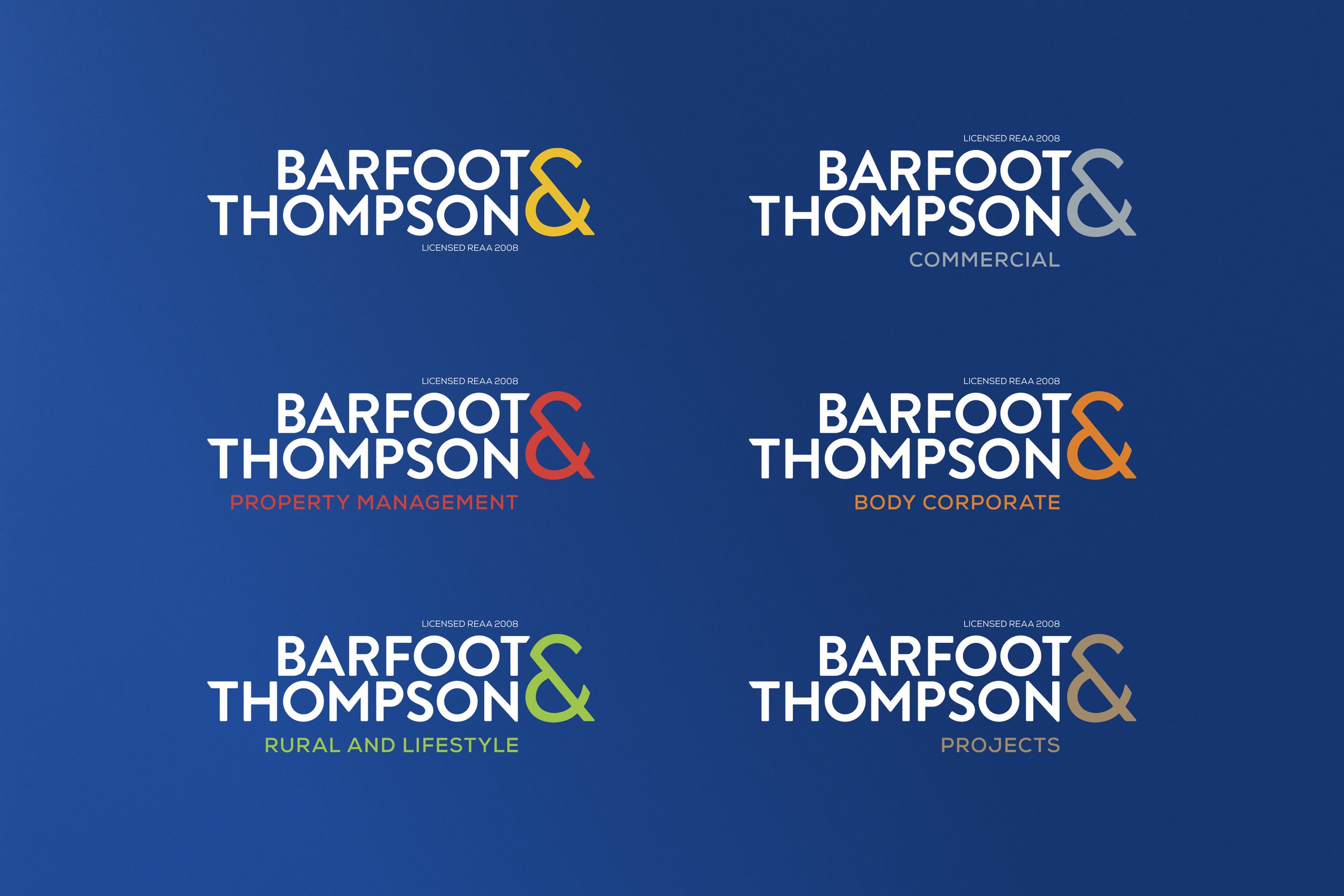
“Importantly, the new brand architecture includes sub-branding for the company divisions,” added Salmon.
“Property management, commercial, lifestyle and Rural, body corporate and projects each now has its own logo and accent colour.”
Progress and positivity
The new-look was unveiled to the staff at a special viewing launch at Eden Park, using its own staff as the talent to talk about what Barfoot & Thompson means to them and how the company is ready to move forward.
“It was amazing,” says Salmon. “Getting to present the campaign and the work in that style to their 1,500 strong staff. They were cheering and there was celebration and everyone was really happy with the results and happy to see themselves on the big screen.”

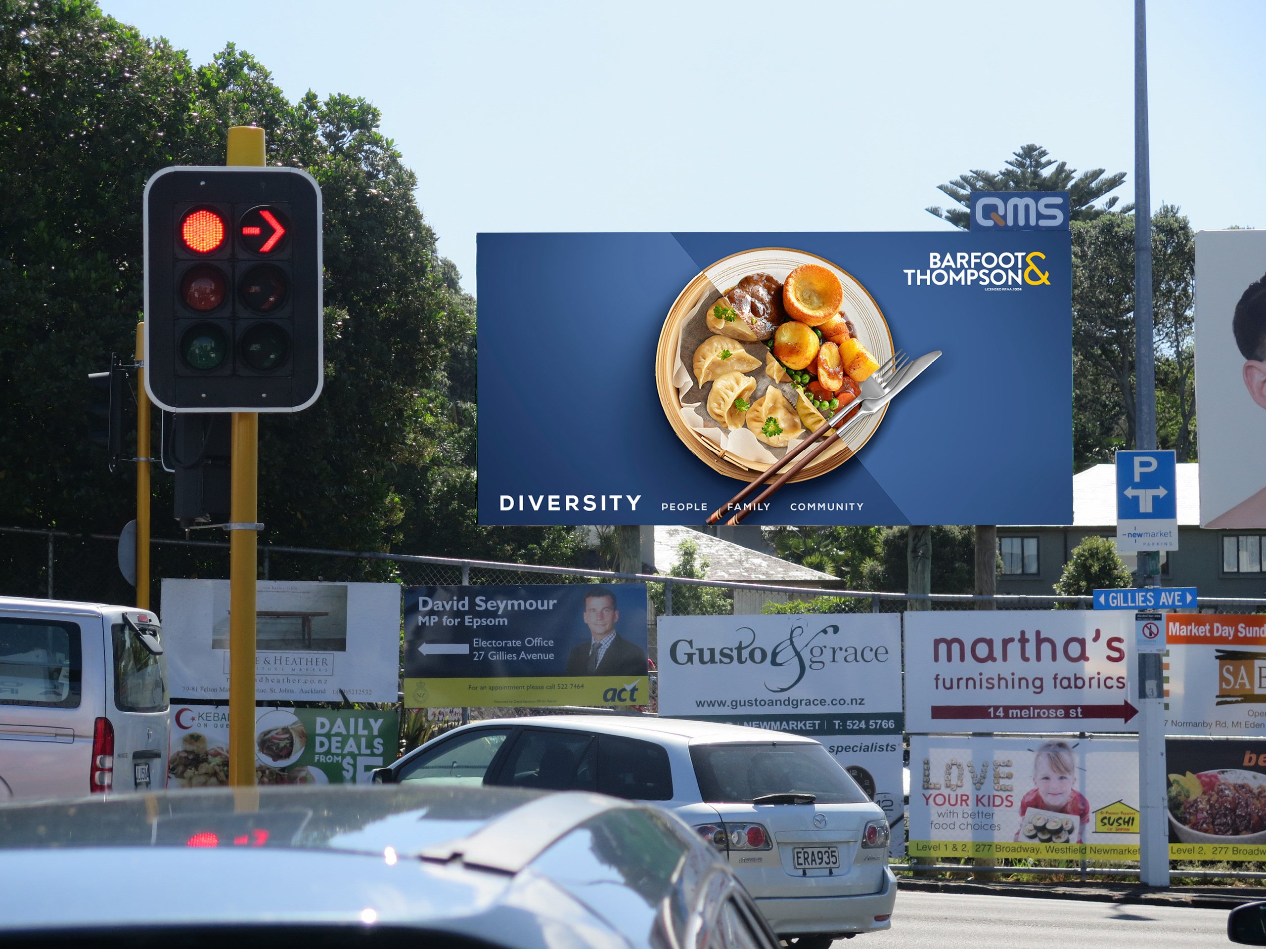
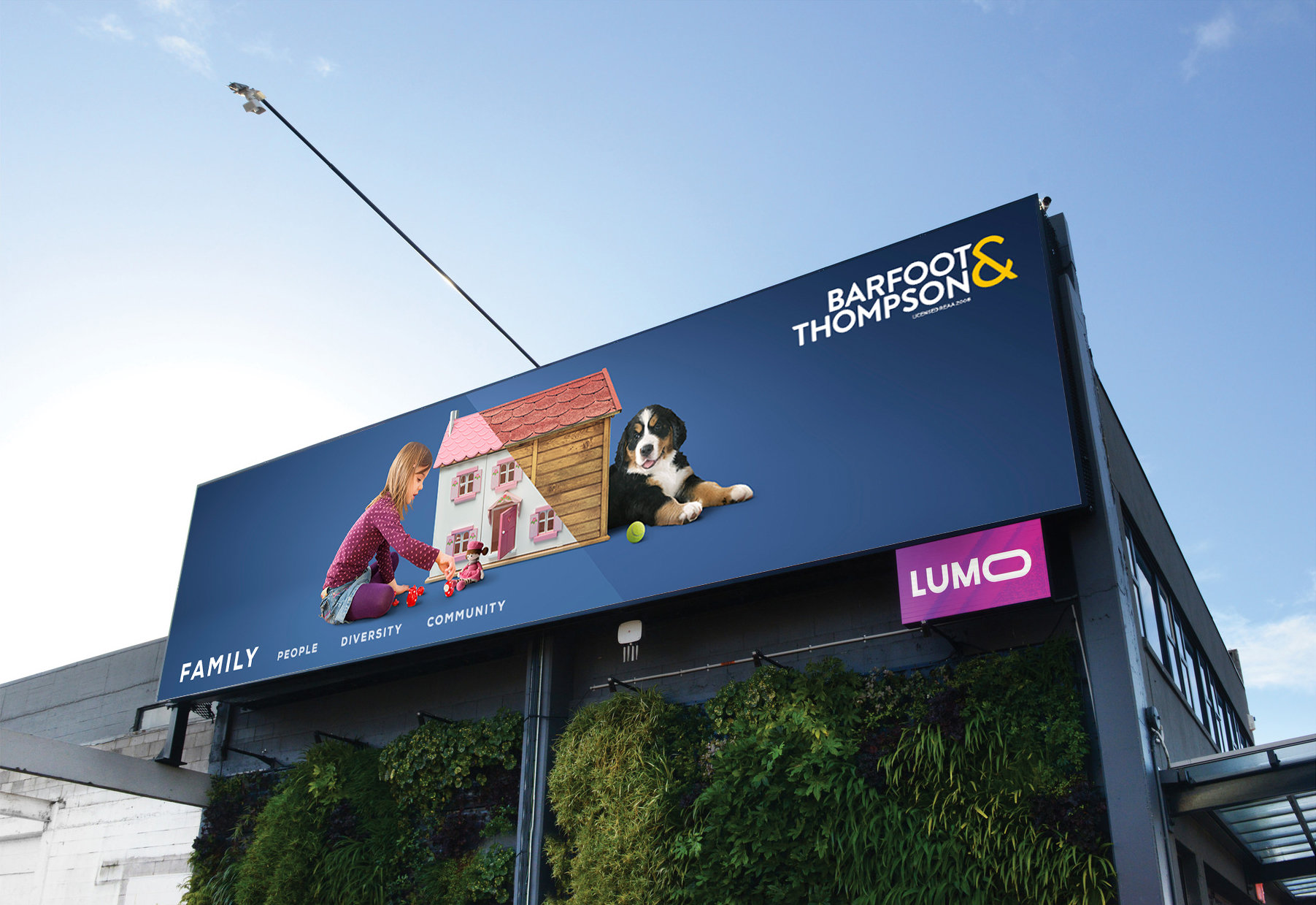
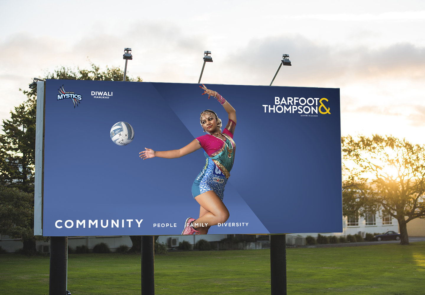
Following the revamp, Big Communications launched an outdoor brand campaign to support the new look and present it to the wider community. The campaign used Barfoot’s values which also helped with the design; people, family, diversity, and community says Salmon.
“The things that Barfoot & Thompson hold dearest are people, family, diversity and community. Pretty much every day since we started working with them in 2011, they’ve demonstrated that. The marketing team gave us a great brief which allowed us to explore the expression of those values.”
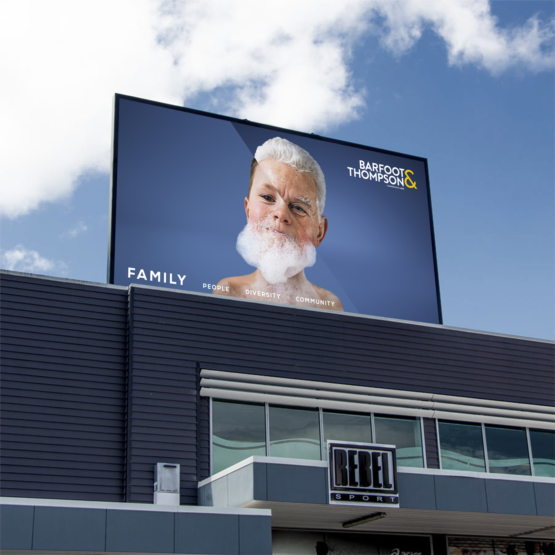
“In every case, we’ve injected a little something,” adds Big’s Joe Holden. “Like a truism, a visual difference or similarity – to make it fun and hopefully more memorable.”
The striking campaign created a lot of brand recognition which is paramount when introducing a rebrand.
By taking out the real estate aspect and focusing on values, the hope is the campaign have higher engagement than traditional advertising.
For Caroline Dobby, advertising manager at Barfoot & Thompson, the new campaign is the chance to show the human side of the company.
“We have plenty of advertising that talks about the things that make us successful – our history, our expertise, our network structure, our innovation and so on. We’ll keep doing that, so that we’re always top of mind for prospective vendors or landlords. But what really sets us apart is the values and culture of this company, and the campaign brings those to life in a delightful and surprising way.”