
Get the latest direct to your inbox twice a week. Sign up today. 
‘Straight from the heart, no bullshit’: Double Denim and Jarred Bishop talk rebranding the Green Party

2017 is election year here in little ol’ Nu Zulund, and with this important political event comes the familiar jostling for the nation’s attention by the powers that be.
Billboards with politician’s faces plastered on them begin sprouting up, campaigns that may or may not have copyrighted arguably one of the most famous songs of the 2000s begin to play, while other politicians show off their teleportation skills in videos.
Most politicians want to accomplish one task: engage the public enough with their message to nab their vote. However, this is no easy feat, considering many view them as age-old, out of touch and even dishonest in their communications.
But the Greens are looking to challenge those perceptions.
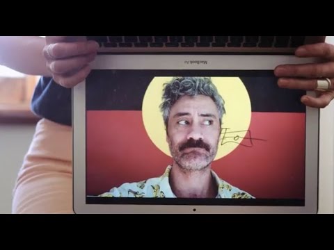
Recently, the Green Party has readjusted its positioning within the political landscape, bringing new, young candidates such as Chloe Swarbrick and Golriz Ghahraman to the front of its ranks, and launching a ‘Great Greens’ campaign earlier this month fronted by Kiwibank New Zealander of the Year and Thor: Ragnarok director, Taika Waititi.
Behind the scenes, Double Denim is the agency responsible for breathing new life into the Green Party’s look and feel. It won the contract for the work last year and brought on board friend and Output Studio founder and designer Jarred Bishop to collaborate.
Shedding the ‘tree hugger’ image
Double Denim co-director Anna Dean says the first step in the redesign process was a brand audit, which helped identify weak spots in the Green Party’s image.
She says the audit found there are some stereotypes that persist about the party, but they don’t reflect what it’s bringing to the table in 2017.
“Predictably, we found there were persistent, out-of-date myths about the party, namely of the ‘tree-hugging, hemp-wearing, loony-left’ variety. It’s a tired narrative that has been reiterated effectively by the current government over the past decade,” Dean says.
“The reality is that no other party is attracting such an impressive, talented range of candidates of diverse ages, background, gender, ethnicity and experience.”
The Great Greens campaign was pulled together off the back of the audit to showcase the wide range of people who support the Greens and showcase the values the party and many Kiwis share, Dean says.
The video, released earlier this month, features a diverse range of New Zealanders sharing what they love the most, with answers ranging from the serious (the planet and artificial intelligence) to the not-so-serious (scented candles and salt-and-pepper tofu).
It’s been well received (admittedly on partisan Facebook pages), with one of the most liked comments on the YouTube video saying: “I get a bit sick of the media lazily portraying the Green Party and their supporters as the loony left fringe. Or as a one-issue party. Pillory me all you like, but I think the Greens have some incredibly capable and intelligent MPs with some well thought-out policies around social issues and the problems confronting Aotearoa in 2017.”

Double Denim co-director Angela Meyer says the idea behind it all was to explain what it means to be ‘green’ in 2017 using a mixture of heart and humour.
“Given the outdated perception of the Greens, we wanted to show people who you wouldn’t normally expect to be ‘Green’: international business people, sports people, everyday mums and dads, as well as some of our more well-known New Zealanders,” Meyer says.
It’s also intended to appeal to the growing realm of businesses with an environmental focus.
But there’s a hairier, more audacious goal behind the campaign. The Greens want to show they’re no longer some fringe party on the side – they’re ready to lead the country.
“We spent time on understanding more about potential voters and working with the party to help them articulate their readiness to be in Government,” Dean says.
She says it was important to emphasise that the ideals they stand for are unique in an increasingly protectionist era of politics, where fear, the threat nuclear attacks* and racism are all too common.
“Green voters have some major points in common. They are into kindness, compassion and community. If that’s not something to celebrate and shout from the hilltops, we don’t know what is. The Trump and Brexit results have shown what comes from hate and fear. New Zealand is in a completely unique position to lead from the bottom of the world on this front and that makes us excited.”
Same logo, different shades
Bishop, one of the designers involved with the refresh, says designing for a political party was a challenging task due to the number of stakeholders involved.


“One of the hard things that takes a while to get used to is everything needs an authorisation statement, so it’s a different kind of signoff for this type of work,” he says.
There was also the concern of what should stay the same for familiarity and what should change.
Much of the look has been updated – particularly on the Green Party’s digital channels – but the logo remains the same, albeit with a few new bolder colour ways.
“One of the things we decided we shouldn’t do upfront is change the logo,” Bishop says.
“It’s such a strong point of familiarity and we were changing everything around it, so we wanted to give their base a point of recognition.”
He says the goal with the party’s new look and feel was to both modernise and simplify it.
“We tried to strip everything back and see what we could do with colour, typography and photography. Something we told them is that they don’t necessarily have to stick to one or two shades of green, they own a portion of the colour spectrum and operate broadly within that.”
The designers ended up coming up with 20 different shades of green, as well as a guideline around when and where they can be used.

The inspiration for the green heart used throughout the Green Party’s campaign
There are also high levels of contrast between the shades to ensure people with colour blindness can still see it.
“We wanted to make sure the design was accessible,” he says.
A “utilitarian, humanist” typeface was also customised for the party by typeface designer Kris Sowersby.
Future-proofing
Bishop says the fresh new look has been well received by those both inside and outside the party.
“Change is always hard, especially with branding projects as people get attached to brands,” he says.
“That’s why we kept logo the same as it is. Internally, the party really like it and the design team love having these up-to-date guidelines and a lot more freedom and flexibility.”
Dean says the Green’s Instagram account is one of the clearest reflections of its change in direction – the three green hearts symbolises the changeover.

The account is currently running ‘takeovers’ from supporters outside the party as well as party members.
There are lots of flowers, landscape shots and human faces featured, a clear departure from the text-heavy images the party previously shared.
Dean says the goal is to widen the perception of who supports the party and why.
“This is all about real New Zealanders sharing what’s important and meaningful to them,” she says. “No hype, no bullshit. It’s just straight from the heart.”
- This story originally appeared on Idealog
*Correction: this story previously implied that Dean said that nuclear attacks were far too frequent. This was a paraphrasing error, which has since been updated to reflect that she was referring to the threat of nuclear war making its way into political discourse.


