
Get the latest direct to your inbox twice a week. Sign up today. 
International and local success: Brother Designs picks up gongs at Dieline and Pride in Print Awards

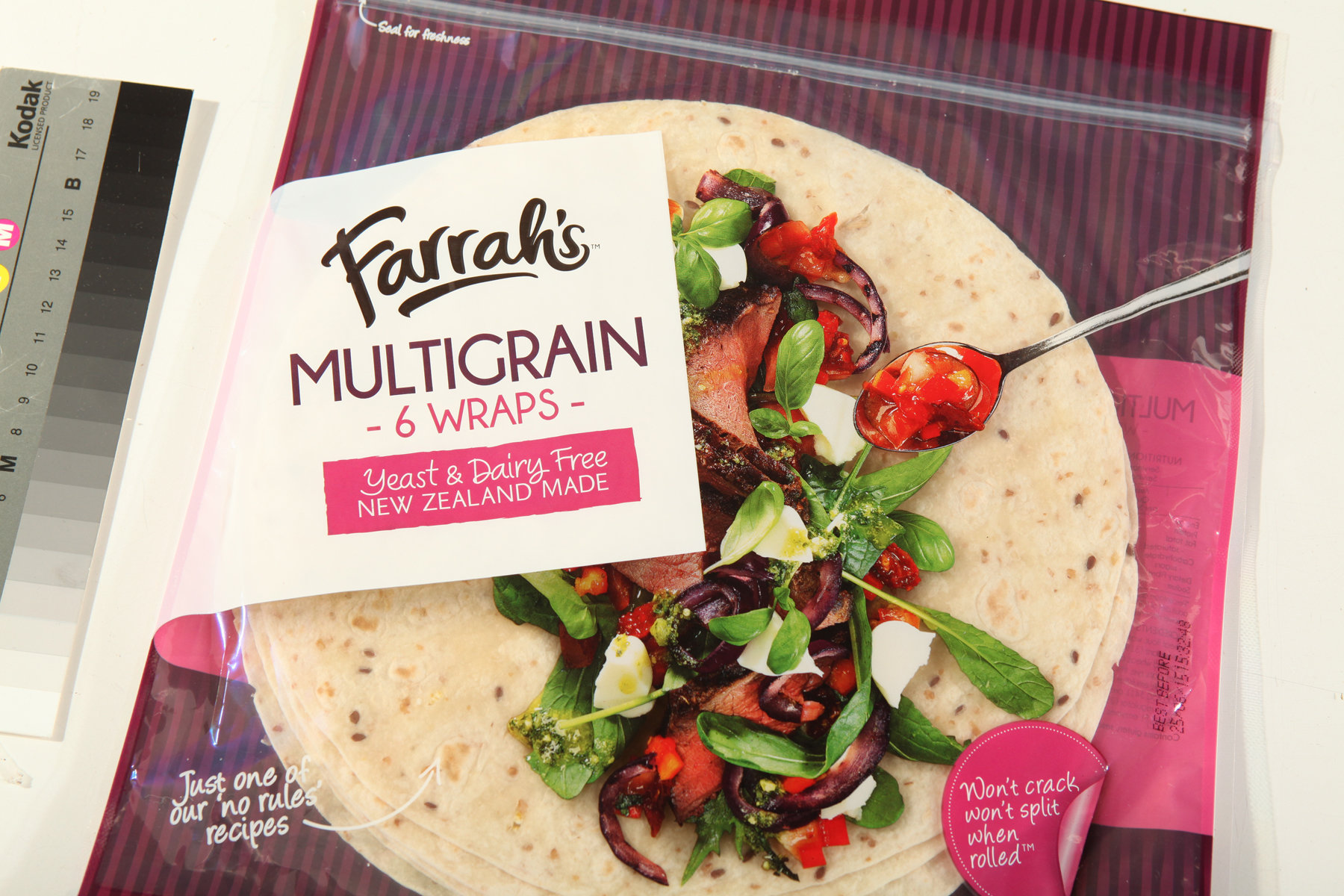
It’s been a good year for Brother Design, with the agency winning first place for its Pams confectionary range in the ‘Confectionary, Snacks, Desserts’ category at the international Dieline Awards in the United States (it was the sole Australasian winner in this year’s competition). Brother Design’s rebrand for Farrah’s wraps also took out the Supreme Award at the latest Pride in Print awards held in Wellington.
The Dieline Awards, which have been running since 2007, are a worldwide design competition recognising the world’s best consumer packaging design.
The winning packaging features a range of quirky animals and characters like a shark, a monkey, a witch and a pirate wearing distinctive hats. Their clothing is see-through to reveal the colourful lollies within.
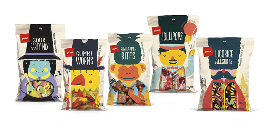
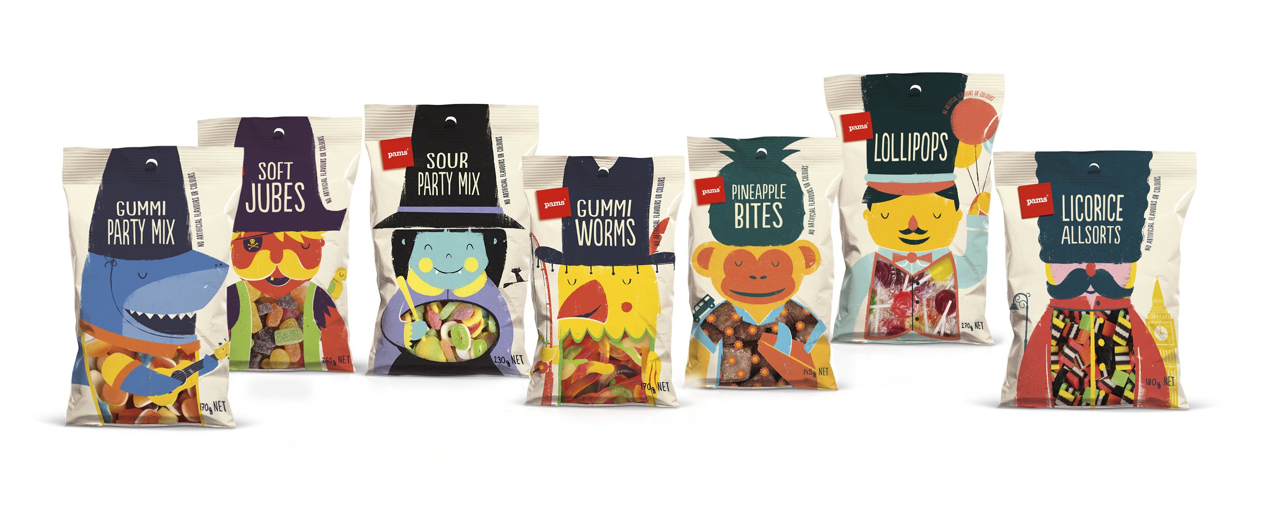
Brother topped 1,100 entries, which included world-renowned brands represented by major global design companies and a high calibre of judges, such as Ronald Burrage, the global head of design for The Hershey Company.
Brother Design director Paula Bunny says: “We had a lot of fun coming up with these designs and everyone involved loved them from the start. But winning this award from The Dieline is a huge honour. Designers worldwide have enormous respect for The Dieline and its awards, it’s a real source of inspiration. So to be a category winner is just amazing, especially as we’re the only agency from New Zealand or Australia to do so.”
Brother Design business development director Jenny McMillan says the awards represent more than another feather in the agency’s cap.
“I think it shows we really are achieving something special, and especially with the work for Pams,” she says. “Bear in mind this is design for private label, taking on and beating the best brand designs by many of the world’s top design groups. It’s a justifiable source of pride for all of us, including our client at Foodstuffs who has been so far-sighted in working with us. The increasing commercial success of Pams is testimony to the power of this kind of distinctive design.”
The ‘Best in Show’ gong at the international awards show was given to Barcelona design shop Dorian for its gin bottles developed for Bar Pesca Salada.

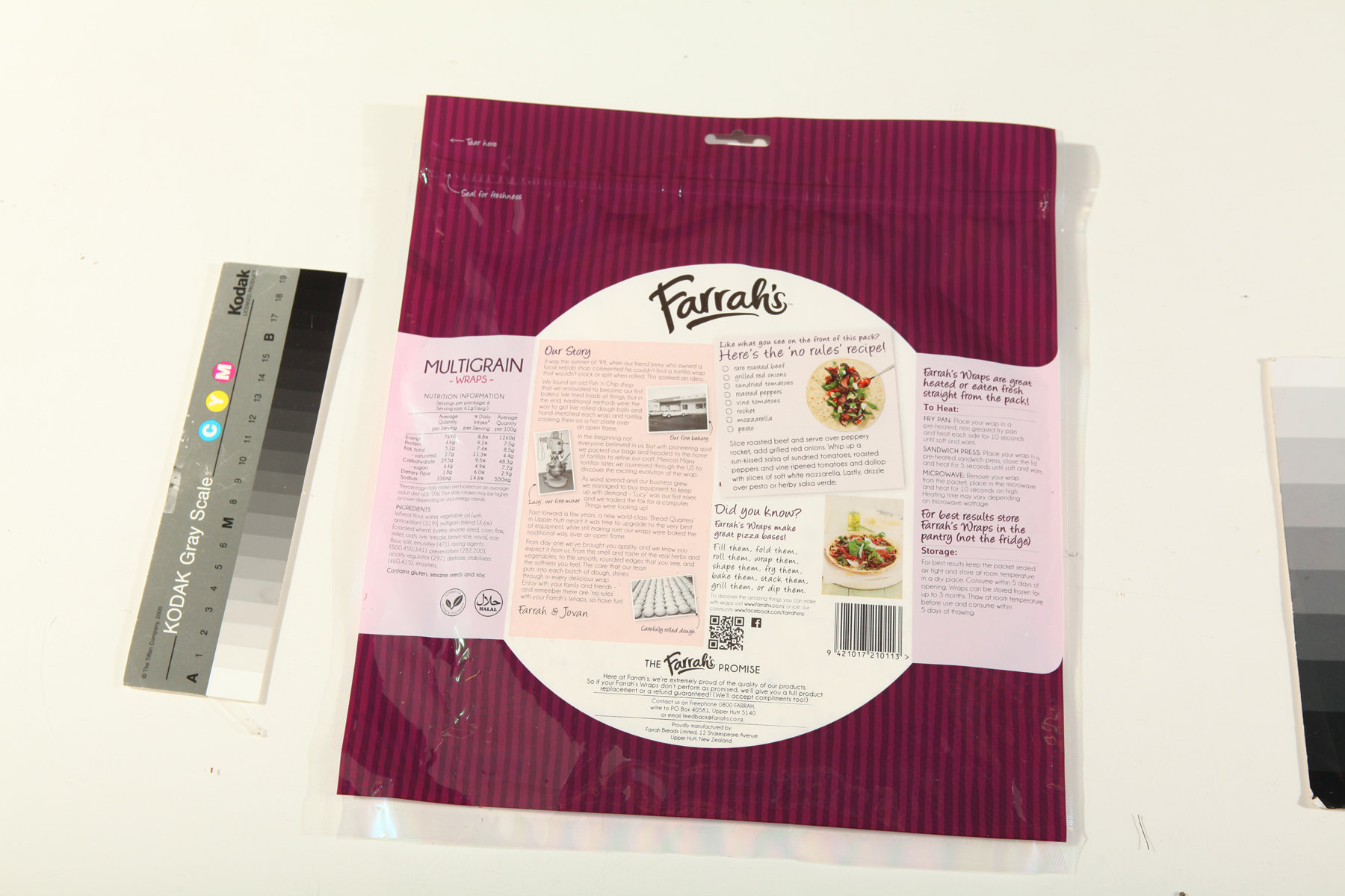
Brother Design also received kudos for its design rebrand for Farrah’s wraps at the Pride in Print awards. The packaging took out Gold medal and the Category win in Packaging and then a win in the Process category before being declared the Supreme Winner of the competition overall.
The Pride in Print awards are now in their 21st year and recognise excellence in printing and packaging.
- Click here to see the full list of category winners.
The judges said Brother’s design for Farrah’s wraps represented “clever design, well executed in print” and were a “great example of designers and printers working together to get a great package.”
Brother Design’s director Debbie Hyde told StopPress earlier the aim with Farrah’s new packaging was to inspire people.
“Give them [consumers]the confidence to use the wraps a little more adventurously. So the delicious-looking photography is almost a recipe: you can see what to do at a glance. And the design uses a clear window to show the actual wrap under the photography, making fantastic results seem that much closer.”
Pride in Print awards chairman Scott Porter says the packaging “…goes straight to the taste buds of the shopper,” and points out that many grocery purchase decisions “…are made by customers in a matter of seconds.”
“The wrapper was designed in such a way as to give the impression the photograph of the food contents is actually in front of the food pouch, sitting on it. In turn the wrapper appears as if it is sitting on a coloured table cloth,” Porter says.
A release says the innovative nature of the design required close collaboration between print specialists Amcor Flexibles Asia Pacific and Brother. “We hadn’t seen anything like this in the market before,” says Hyde. “So getting a perfect result, recognised with such an award, is a huge testament to Amcor’s abilities and our teamwork.”
The Multigrain packaging wasn’t the only Farrah’s design to win on the night, with their 8” Premium White Wraps also attracting a gold medal in the ‘Packaging’ category for Amcor and Brother.
Brother Design picked up four awards earlier this year at the Vertex Awards for its design work for Foodstuffs New Zealand Limited, including two category-leading golds, a silver and a bronze.
The gold awards were for the Pams confectionary range in the Packaged Goods category, and the Neu personal care range of soaps, shampoos and deodorants in the New Brand category. Designs for the Pams Fresh Pasta and Sauces range picked up silver in the Fresh category. And Bronze was awarded in the Healthcare category for the Pams Feminine Hygiene range.


