
If design is a reflection of our times, what do current design trends say about where we’re at? Shiv Narandas, Design Lead, and Jane Langley, Associate Creative Director at True, unveil the power of design and shine a light on the artistry that reflects societal values.
Design has always been a reflection of the times. When society’s values change, so does our taste in design. It’s interesting to correlate our increasing emphasis on diversity and inclusion values with the re-emergence of Maximalism as a design trend.
Maximalism is all about embracing a “more is more” mentality. Vibrant colours, complex patterns, ornate typography, and busy compositions. It’s an approach that celebrates diversity. True Design Lead Shiv Narandas says: “Maximalism feels right for these times. It feels like a reflection of a more tolerant and inclusive society.”
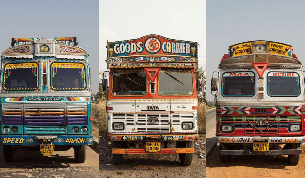
Image credit: https://edition.cnn.com/travel/article/india-truck-art-travel-design/index.html
“At design school, students learn all about minimalism – stripping things back to their most fundamental elements. And that is a great design discipline to understand. But then in my actual life, I go to an Indian or Samoan wedding, and everything is so epic and beautiful. And it makes me wonder, why doesn’t that maximalist aesthetic show up more in everyday brands?”
To understand the differences in style: Minimalism, aka the Swiss Style, emerged in the 1950s as a response to the complexity and clutter of the design styles that came before it. The Swiss style is characterized by clean lines, simple typography, and a grid-based layout system. This approach soon became synonymous with ‘good design’ principles, with its emphasis on simplicity, order, and clarity. But the flipside is that things can start to look sterile and lack personality.
Is it time to pack minimalism away into a gold-gilded trunk, at least for a while? Shiv thinks so. “In the world of graphic design, ornamental details are often seen as unnecessary clutter. But in many cultures, these details hold rich meaning and value. So through that lens, minimalism can come across as a lack of care.”
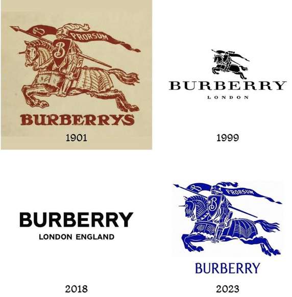
Image credit: https://www.clementinehouse.com/blog-news/why-did-burberry-rebrand-in-2023-again
A few years ago, we all witnessed the big swing away from handcrafted logos to super simplified sans serif typefaces. The recent Burberry rebrand is a great example of how the pendulum has now swung back the other way. Their classic lettering and illustrated horse symbol were replaced with a minimalist bold sans serif logo in 2018. Reactions were mixed, but mostly negative. “All the personality and uniqueness was gone.” And now, just five years later, they’ve reverted back to their original illustrated horse symbol and logotype, albeit a more refined version.
“Design is all about solving problems, but in today’s climate, with transparency being a huge thing, I think people are actually interested in seeing HOW we solved that problem, and almost feeling part of that process.” Maximalism provides more opportunity to invite your audience in, because it allows for multiple layers of meaning and detail.
The Tinder print campaign It Starts with a Swipe is an electric neon homage to the maximalist aesthetic. Melissa Hobley, Tinder Global Chief Marketing Officer, explains it as a celebration of diversity. “Tinder daters are embracing unconventional experiences and a whole new vocabulary and we are excited to be able to reflect their reality through a vibrant and lush imagery in our campaign. We were inspired by this new generation and how uniquely they look at themselves and their dating lives.”
As our world becomes more connected and globalised, we are exposed to different cultural aesthetics. Maximalism embraces this by incorporating a wide range of design elements from different cultures. “Maximal design is inclusive by default. If everything’s in, that means nothing is out. It’s an exciting new opportunity for everyone, and particularly for designers who previously felt they couldn’t put their whole selves into their work,” says Shiv. “It’s about giving yourself permission to add things.”
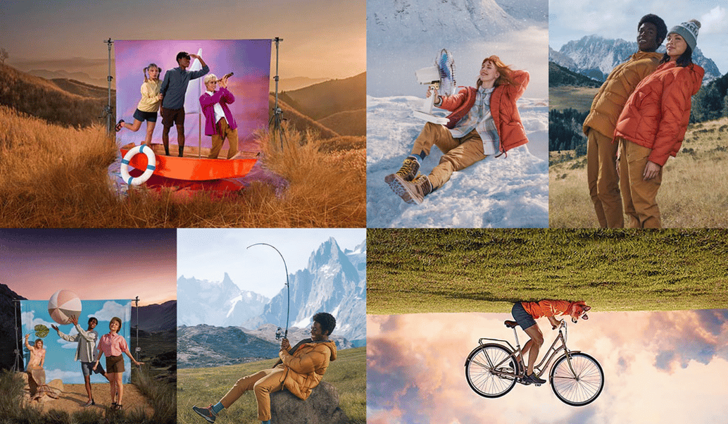
Image credit: http://www.leuver.com.au/kathmandu.html
The current We’re Out There campaign for Kathmandu by Special is a celebration of maximal expression in many forms, and it’s hard to look away! Shiv is a fan of the campaign. “It’s great when clients understand that we’re not talking to “everyone” – we’re talking to a specific audience. The people who find your work interesting ARE the audience. Trying to appeal to everyone dulls down your aesthetic.”
Of course, this is not to say that simplicity is no longer important in design. It is a powerful tool for communication and clarity (especially in logo design where identification is paramount), and will continue to be an important influence in graphic design. But increasingly designers are recognising the value of complexity and diversity in the wider brand language, and embracing the power of maximalism to celebrate the richness of different perspectives.
Shiv is here for it. “Design trends come in waves. As society evolves and changes, so do our design preferences. It’s cool to see people becoming more comfortable with complexity and diversity, in all forms. Bring on the colour clash!”
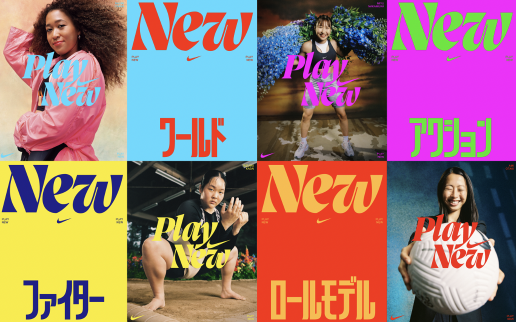
Image credit: https://www.maxpilwat.com/nike-play-new
As we see more cultural diversity represented in creative and design roles, our collective taste in design will continue to adapt accordingly. It’s exciting to start to see the resulting expansion of inspiration and output. The world of graphic design will be richer for it. What do you think? We’d love to hear your thoughts.


